The Brief
Create a distinctive identity that feels refined and established, while reflecting the energy of a new generation of talent.
What We Did
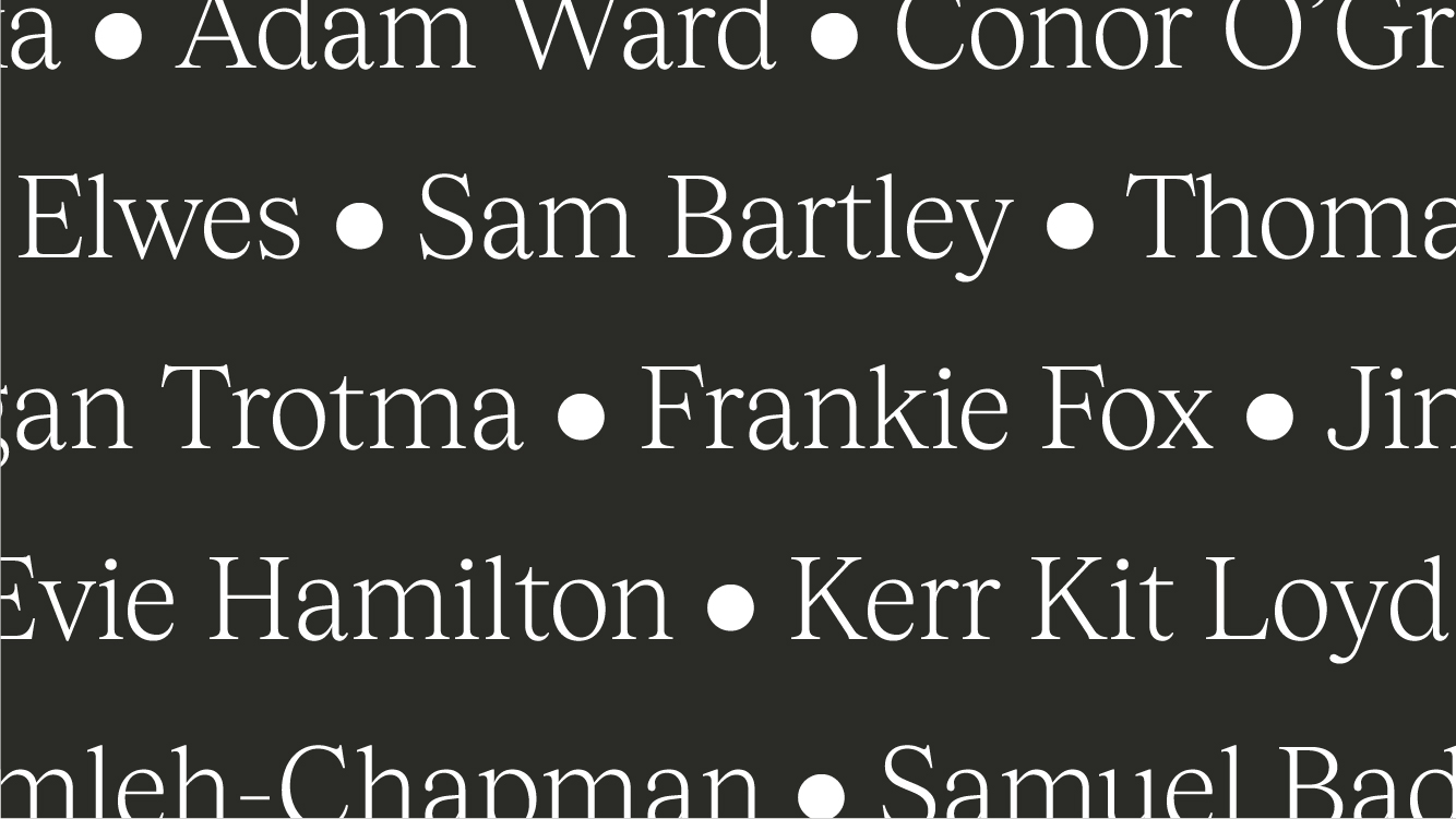
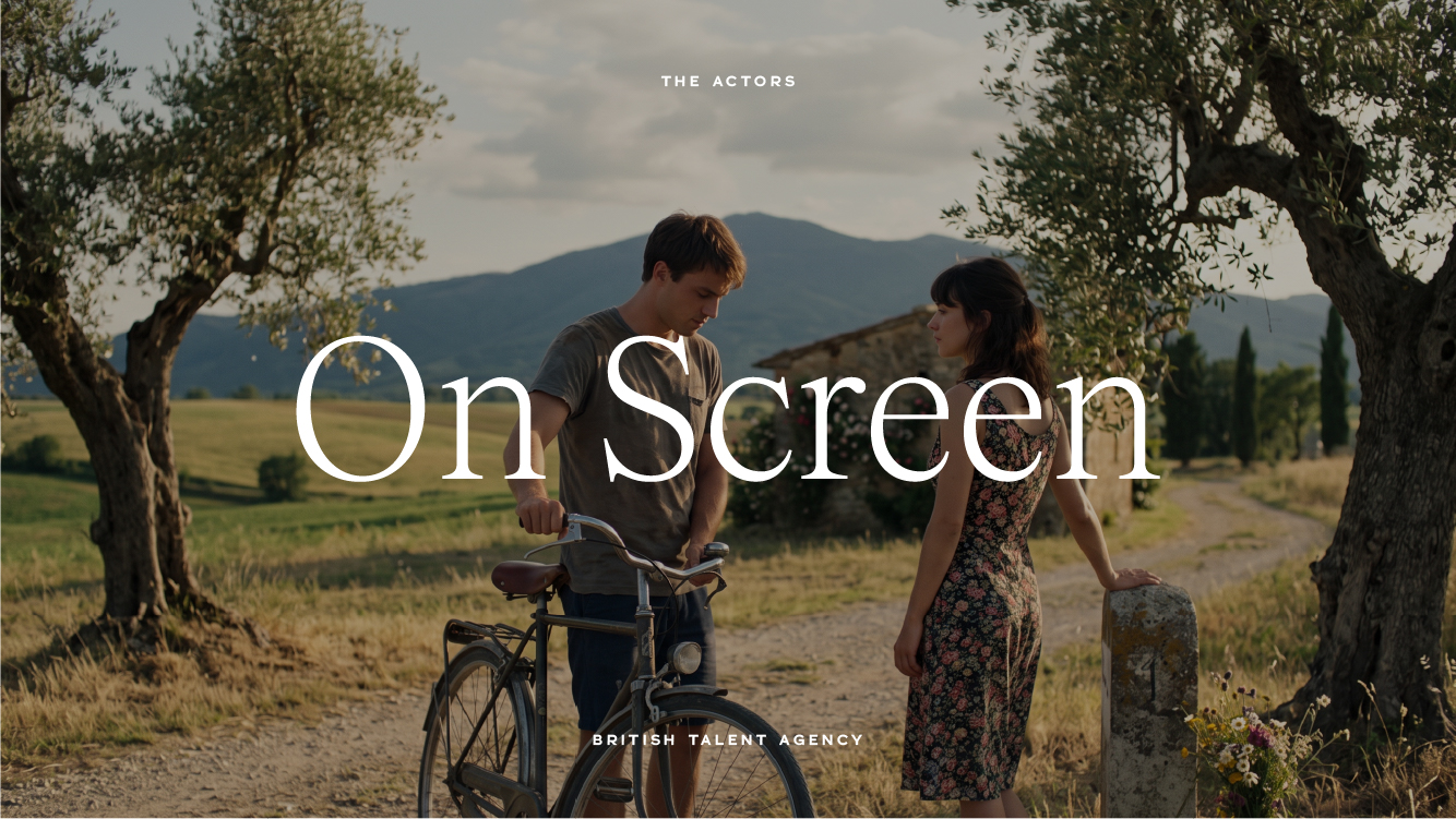
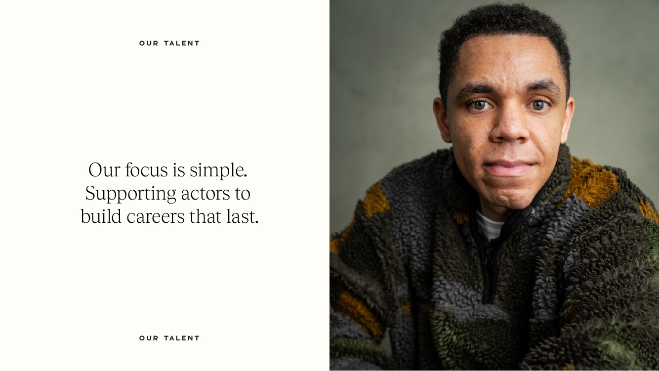
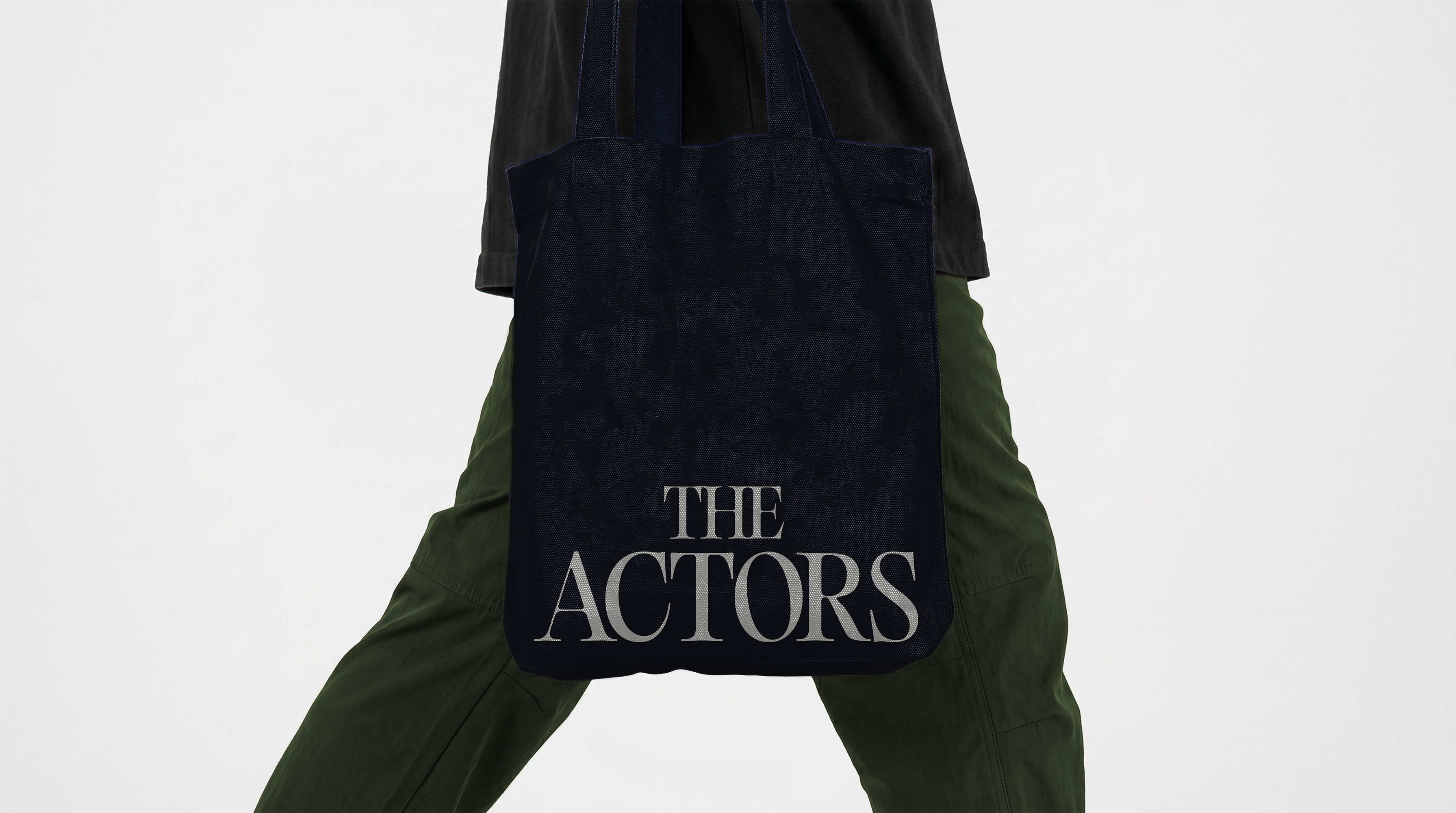
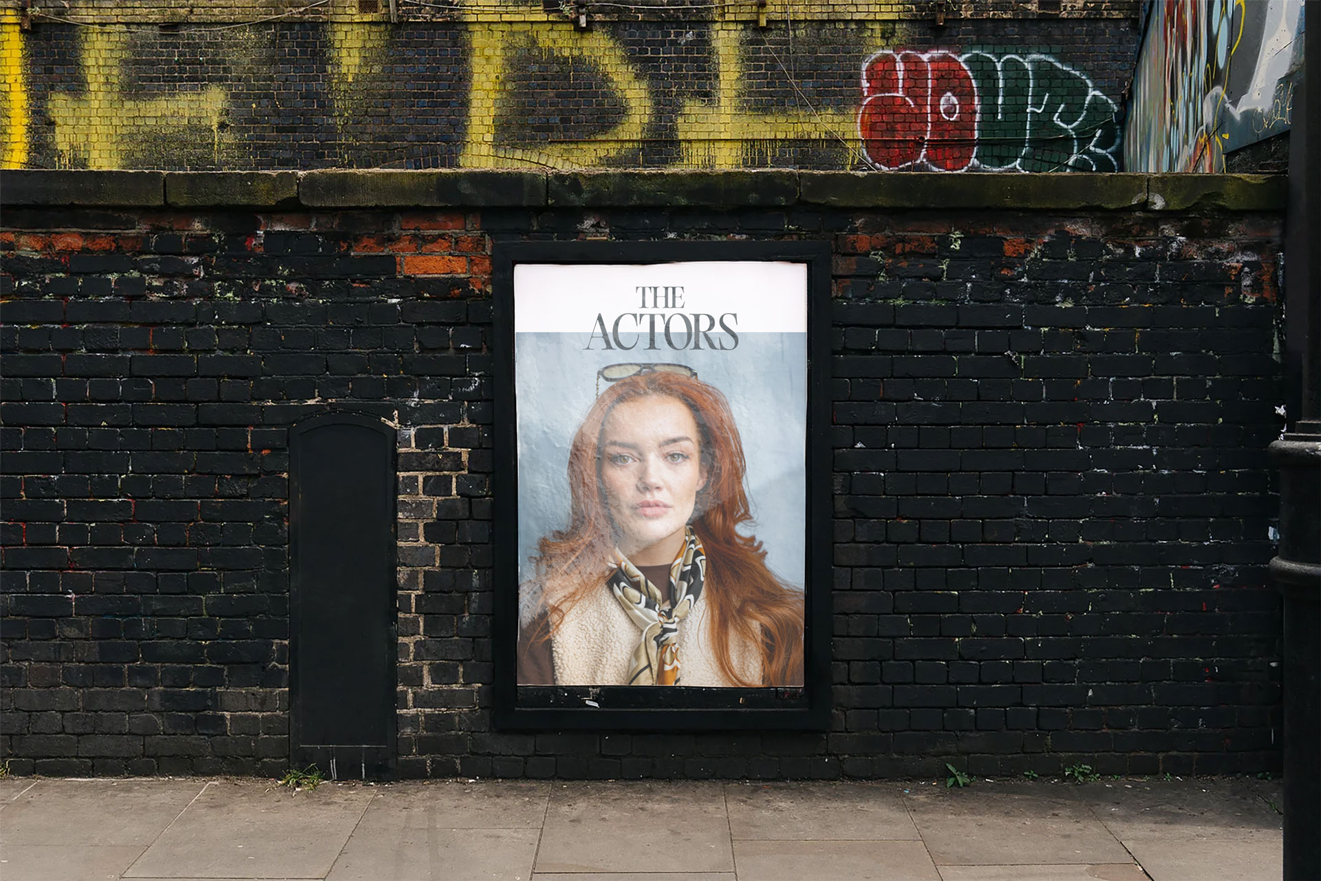
We created a modern, timeless identity built around refined typography and a confident, understated visual language. The result feels classy and established without feeling traditional, giving The Actors a distinctive presence that can grow with its talent.
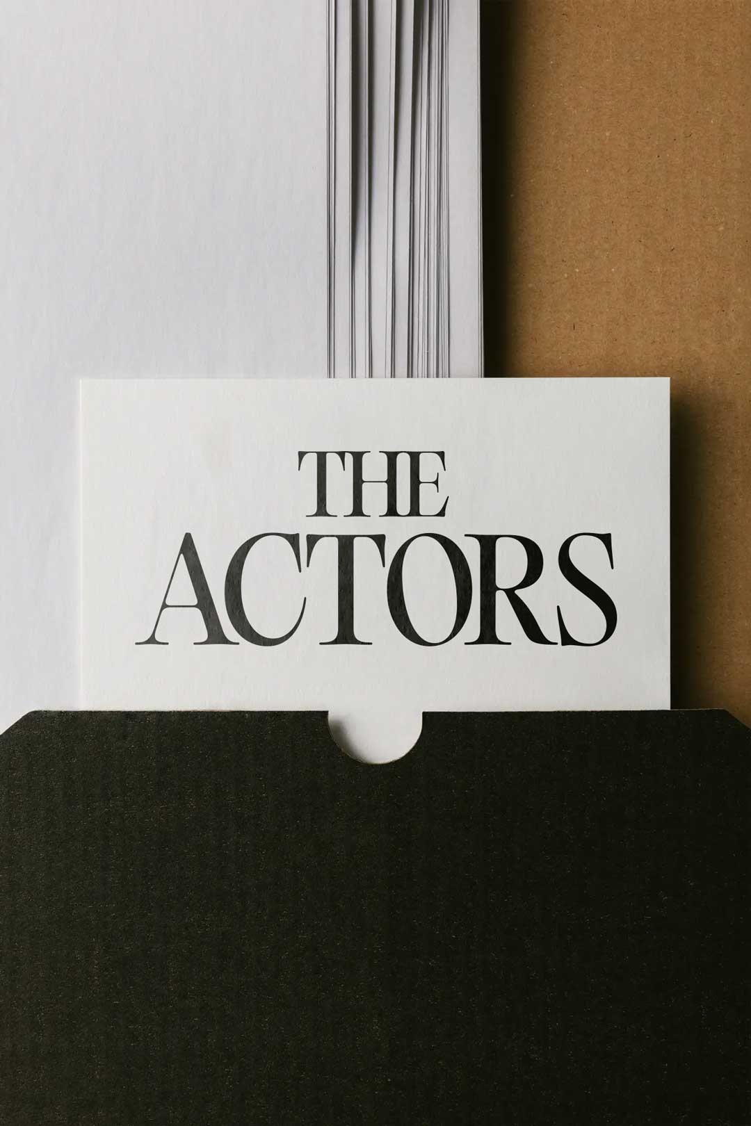
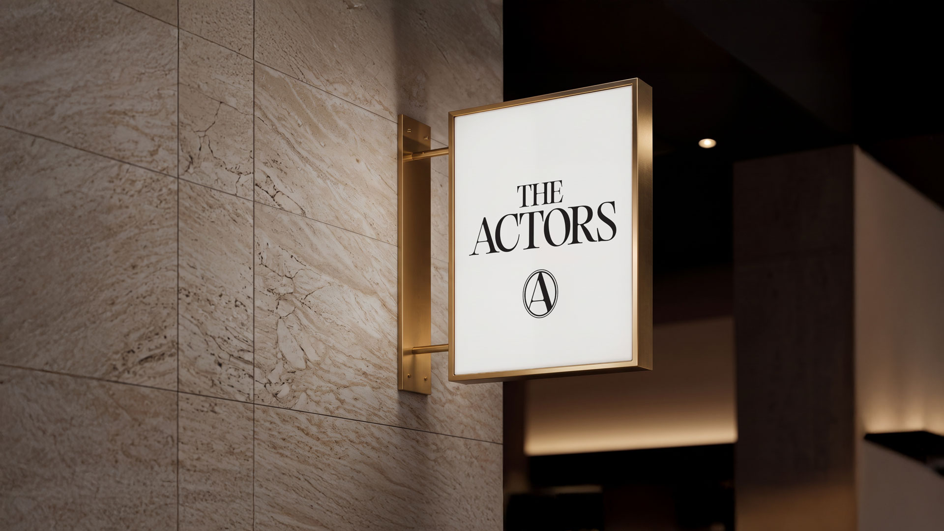
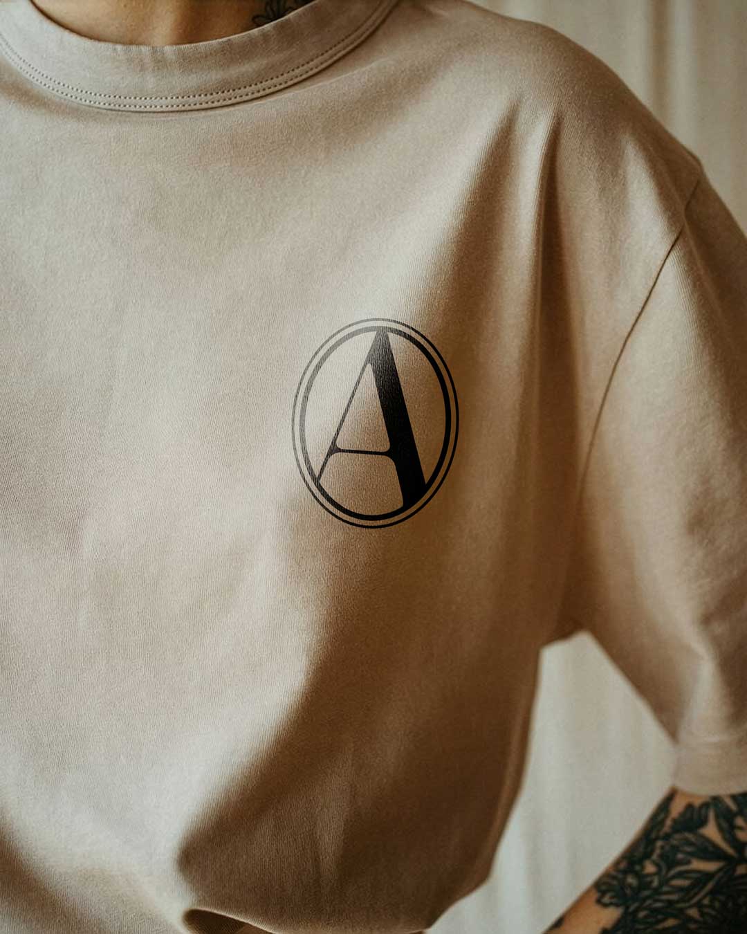
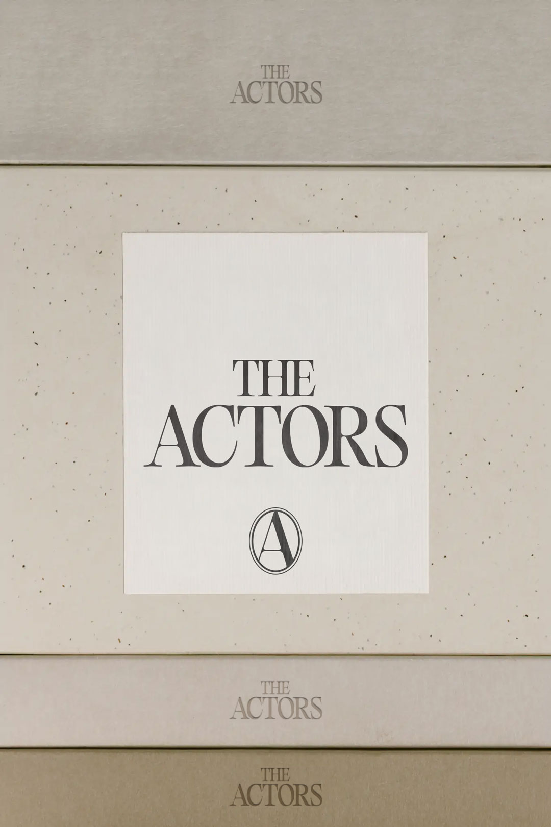
The logo draws on old-world heritage, taking cues from established media brands like Vanity Fair, Variety and Ogilvy. It evokes credibility, history and sophistication. The kind of logo you might spot on Wardour Street, alongside major film and TV production companies.The type mark was drawn by hand, giving the identity a more distinctive and personal character. Every letter was carefully shaped to create a mark that feels considered, but never overly polished.
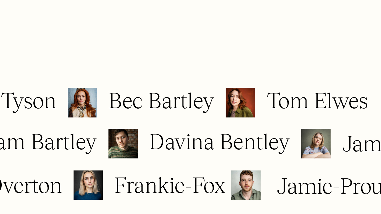
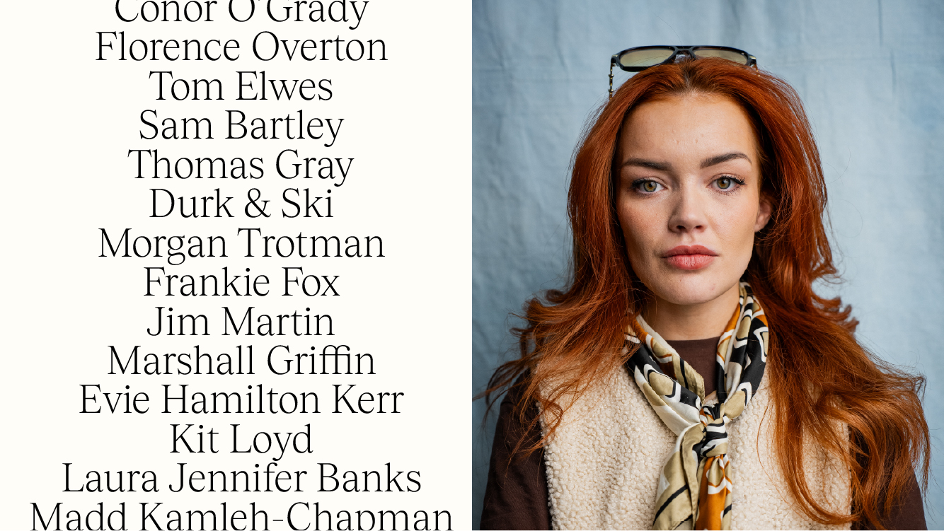
A clean, elegant layout gives the website a refined and modern feel. Clear navigation and considered typography keep the experience simple, putting the focus firmly on the talent without unnecessary clutter or distraction.
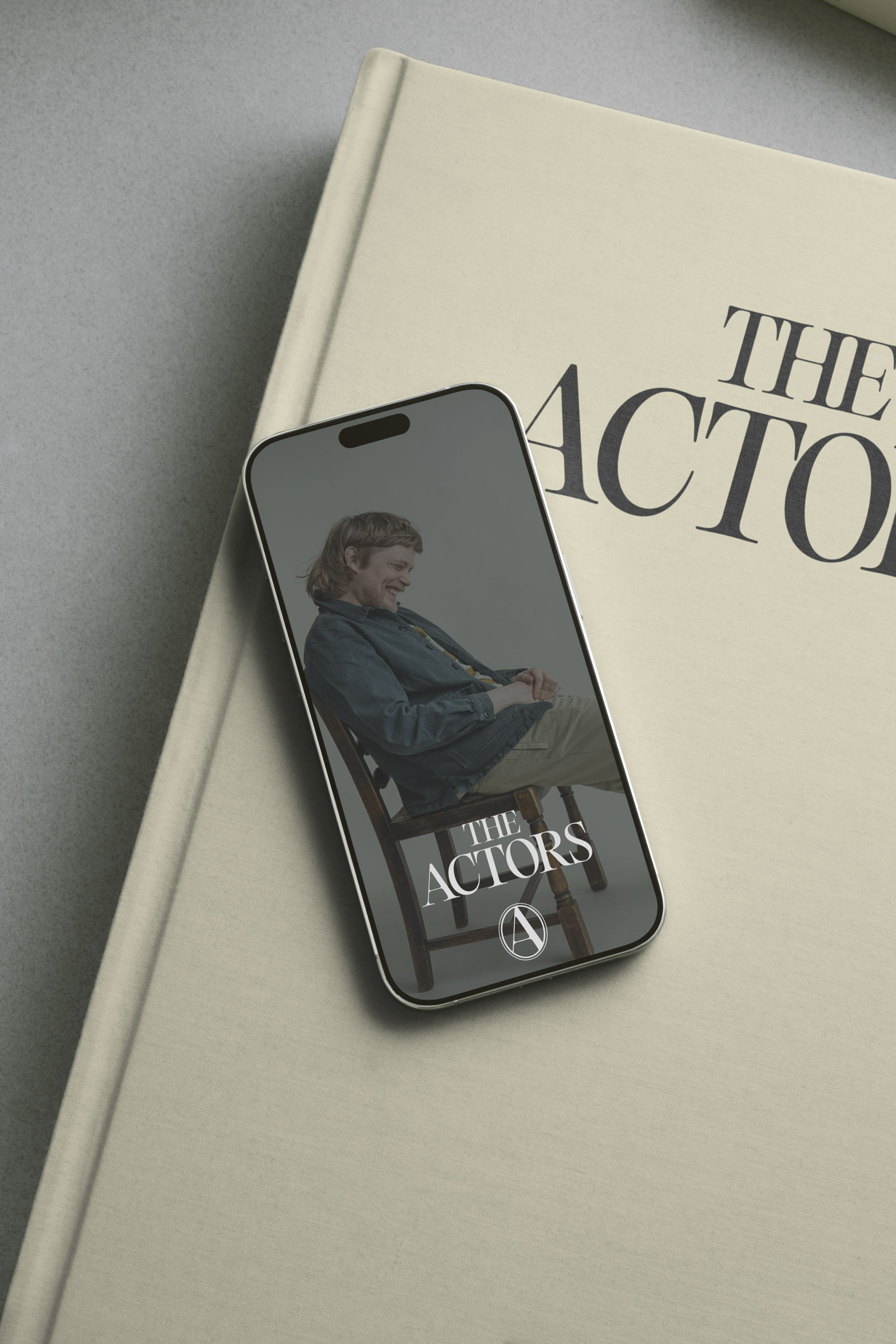

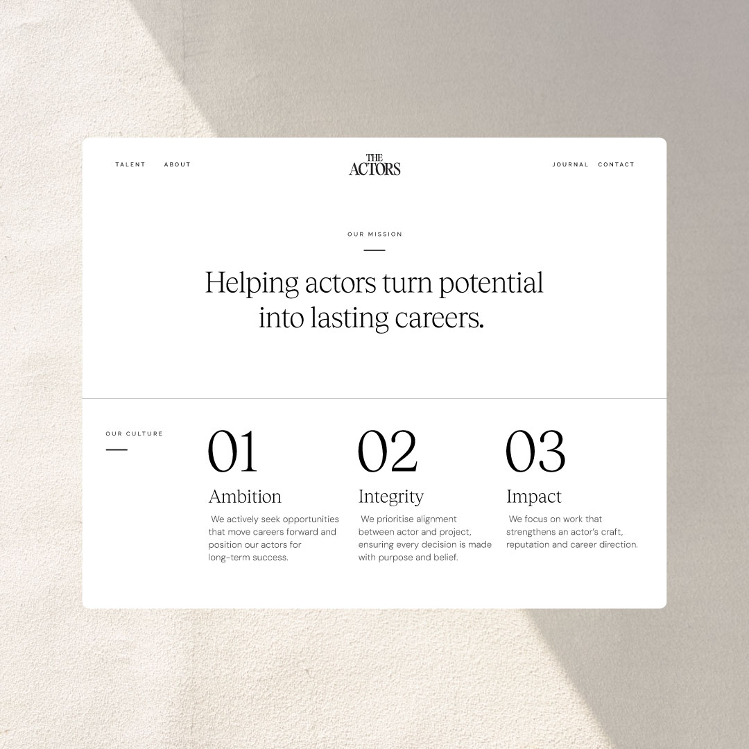
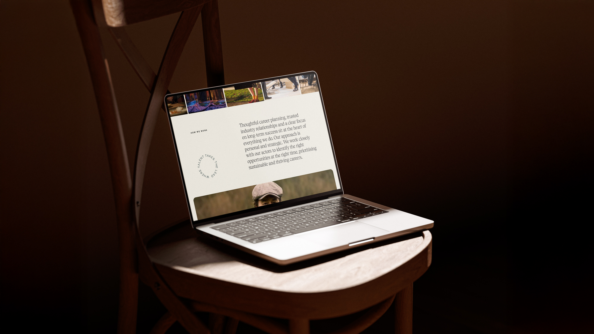





Tobias typeface brings a refined editorial feel to the identity, balancing classic character with a contemporary edge. Its distinctive forms give the brand a sense of sophistication and personality, while remaining clear and versatile across the website and wider identity.