Client
Services
Brand Story
The Design Chapter is a creative design agency specialising in retail, commercial, and hospitality projects. They work with household retail and finance brands across the UK, including Primark, McColls, and Leek United Building Society.
The Brief
The agency wanted a brand and website that felt playful, innovative, and bold, while projecting professionalism and intelligence. The goal was to tell the story of the brand and showcase key case studies in a dynamic and unique way.
What We Did
The brand needed to feel honest, approachable, and down-to-earth, yet also forward-thinking, creative, and daring.We developed a visual identity that paired modern and bold design with elegant, traditional elements. Layouts are striking and contemporary, while typography maintains a timeless, established feel—positioning The Design Chapter as both relevant and enduring.
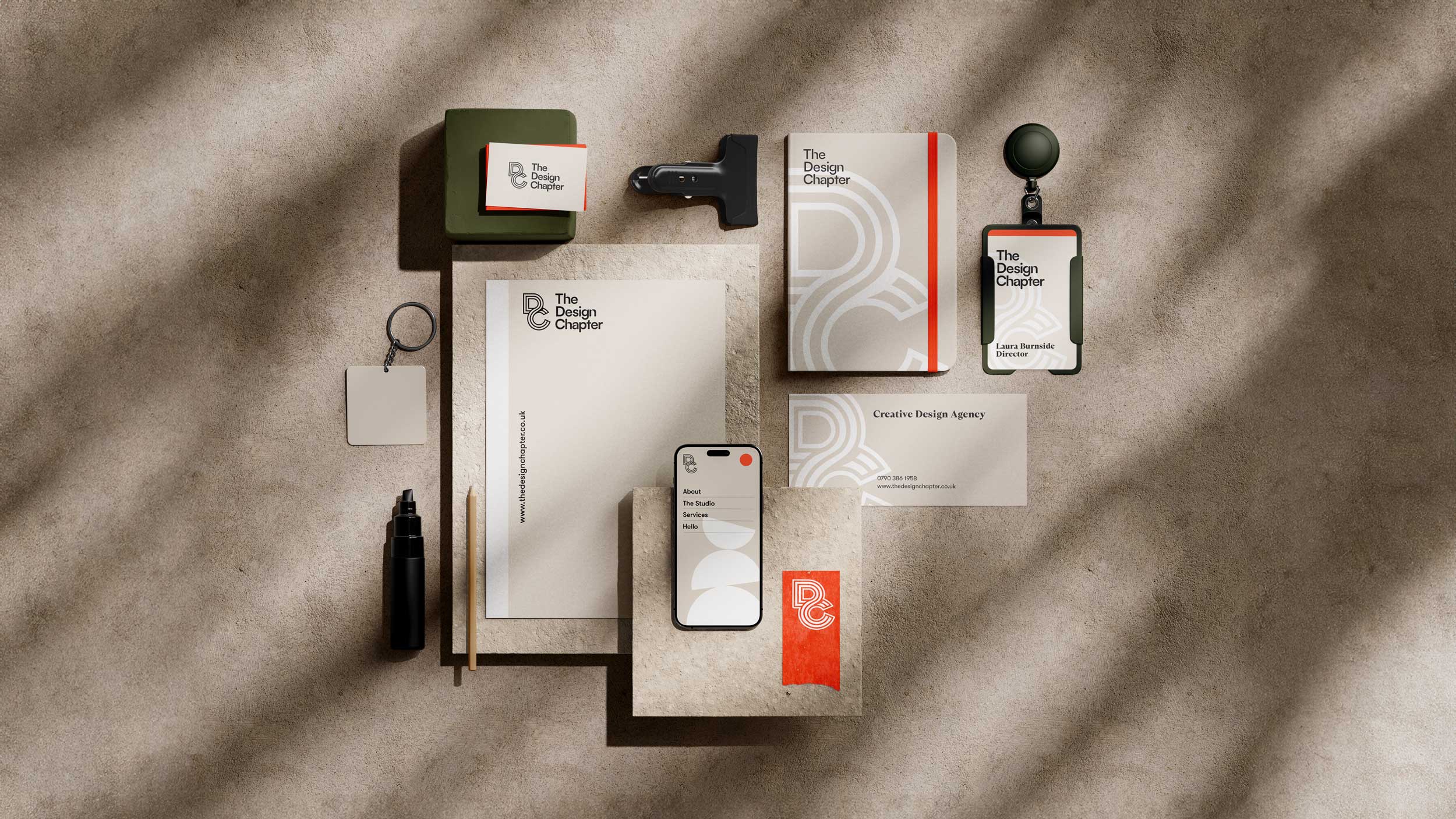
The logo features a monogram of connecting lines, symbolising trust, speed, and efficiency. This monogram is paired with a customised typeface, including subtle curved flourishes that echo the geometric shapes integrated throughout the brand.
A key visual element in the identity is a selection of colourful geometric shapes. These shapes are used dynamically in graphics and animations throughout the website, adding movement, engagement, and a playful energy.
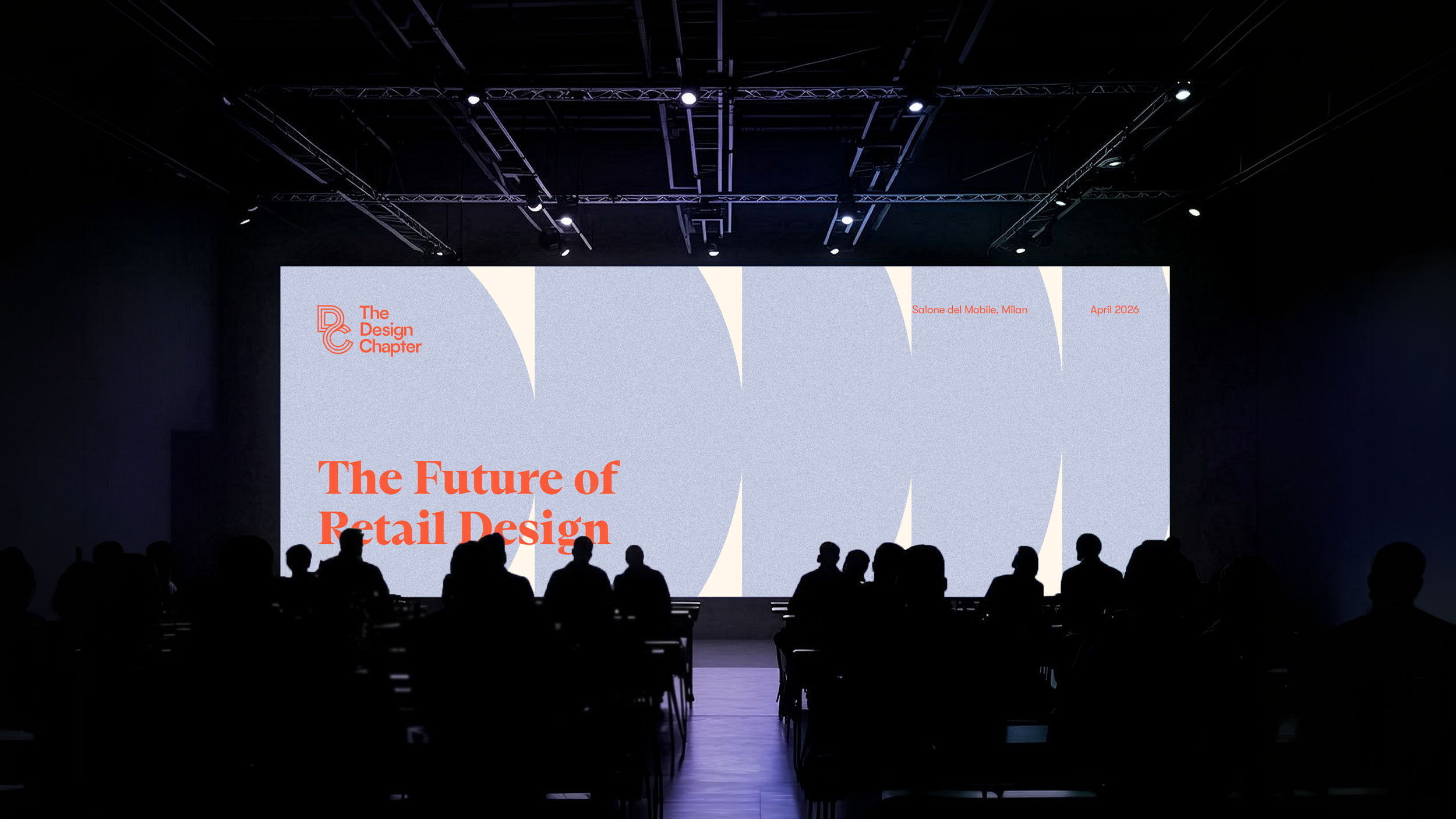
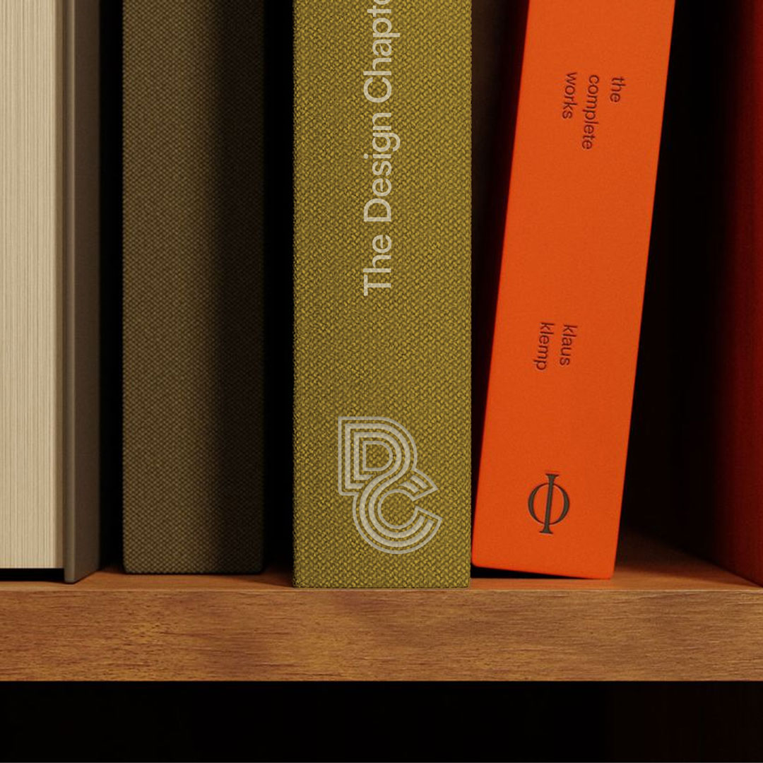
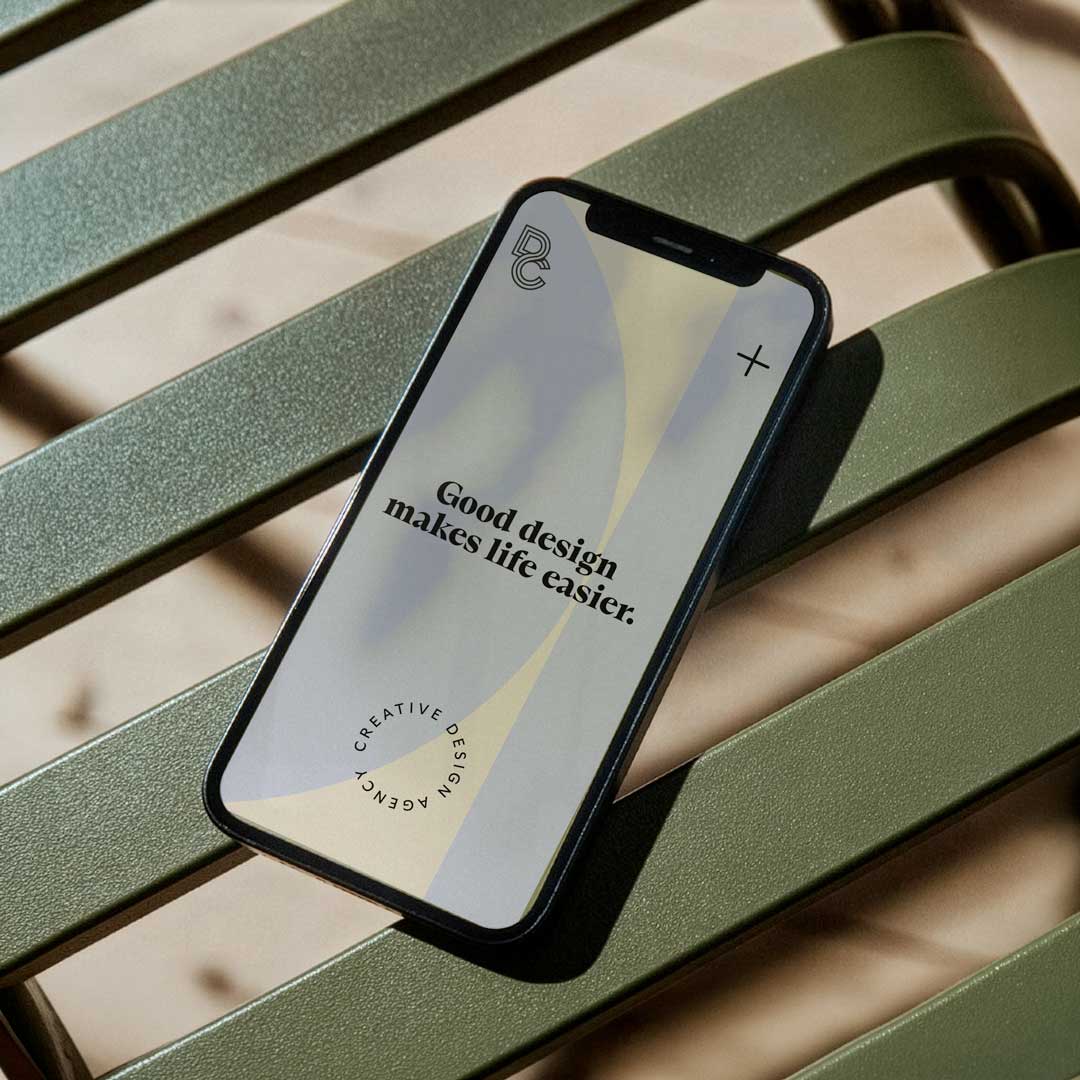
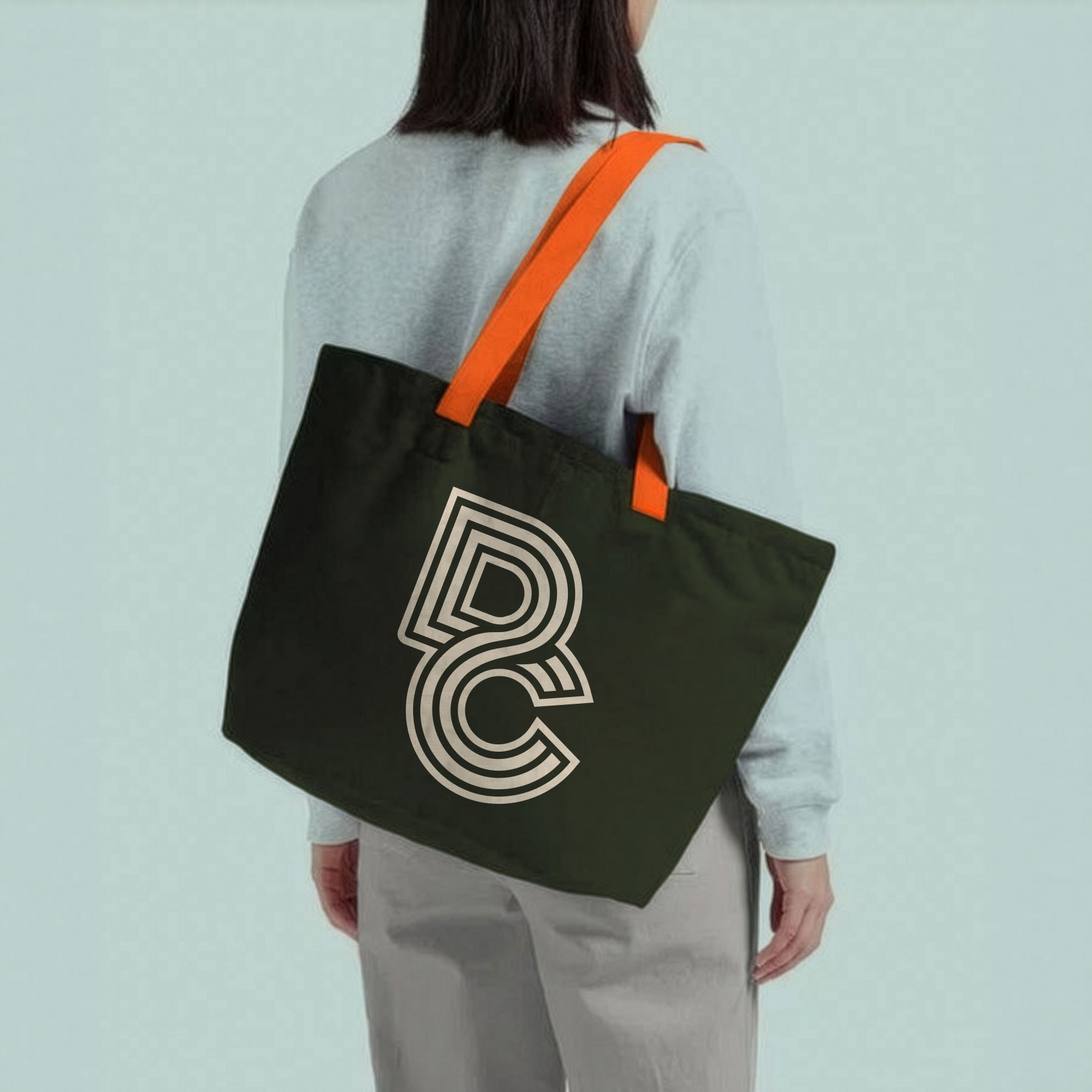
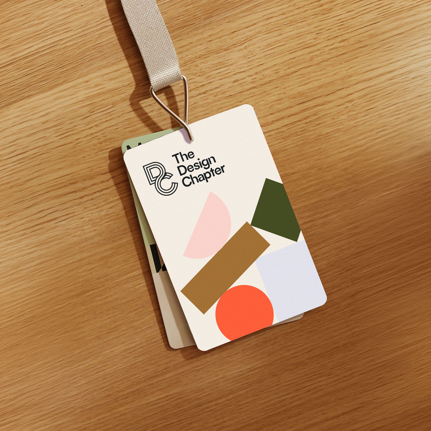
The primary palette consists of neutral tones, conveying sophistication and thoughtfulness. These are accented with vibrant, bold colours used sparingly to highlight key brand elements, such as logos and graphics. The result is a fresh, modern, and playful feel that stands out without overpowering the brand.
To support Indie Lab’s scientific storytelling, we developed a series of bespoke illustrations and motion graphics that visually represent the complexities of brain and cognitive function. Each graphic was designed to make scientific concepts more accessible, using bright colours and simple, engaging visuals. These elements help bring an abstract subject matter to life, enhancing the overall experience of the website.
Our focus for the website was creating a highly accessible and user-friendly experience. We used a soft, warm colour palette paired with clean, soft typography—specifically, the GT Ultra font—to ensure readability and ease of use. The result is a seamless navigation flow, allowing users to explore research topics effortlessly, while the subtle yet inviting tones give the website a welcoming feel, making complex scientific work more approachable.