"Can't we just keep it simple: Love one another and do good?"
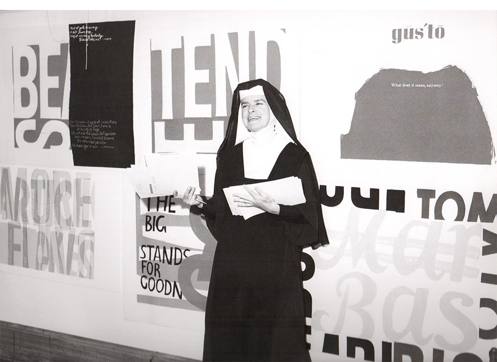
An artist, educator, activist and, for much of her life, a nun, Corita had a remarkable ability to turn everyday words, familiar imagery and ordinary objects into something full of life. Her work was colourful, expressive, playful and unapologetically positive. It was also deeply human. For us, she's a brilliant reminder that design doesn't have to follow the rules to make an impact. In fact, sometimes the best work comes from doing quite the opposite.
Who was Sister Corita Kent?
Born Frances Elizabeth Kent in Iowa in 1918, Corita moved to Los Angeles as a child. At just 18, she joined the religious order of the Immaculate Heart of Mary, taking the name Sister Mary Corita.
Art quickly became a central part of her life. She studied art history, developed her skills in printmaking and went on to teach at Immaculate Heart College, eventually becoming head of its art department.
It was here that she developed much of her distinctive approach to art and design, encouraging students to look beyond traditional artistic boundaries and find inspiration in the world around them.
By the 1960s, Corita was becoming an influential figure in the American art scene. Her work explored everything from religion and spirituality to consumerism, civil rights, poverty and the Vietnam War. She believed art could be a powerful way to communicate ideas, challenge perspectives and bring people together.
In 1968, she left the religious order and moved to Boston, where she continued to create art until her death in 1986.
Pop art, but with a little more heart
Corita's work emerged alongside the American Pop Art movement of the 1960s. Like Andy Warhol and other artists of the time, she borrowed from the visual language of everyday life: advertising, packaging, shop signs, newspapers and popular culture.
But she took things in her own direction.
Where much of Pop Art explored consumerism, celebrity and mass production, Corita brought something different to the table. Her work was rooted in compassion, spirituality, social change and an overwhelming belief in the good of people.
She took familiar words, slogans and images and gave them a new meaning. Advertising language became a vehicle for messages of love, peace and equality. Everyday typography became something expressive and full of emotion.
She wasn't interested in simply replicating what was popular. She took inspiration from the world around her and made it entirely her own.
That's what makes her work so distinctive. It feels familiar, yet completely unexpected.
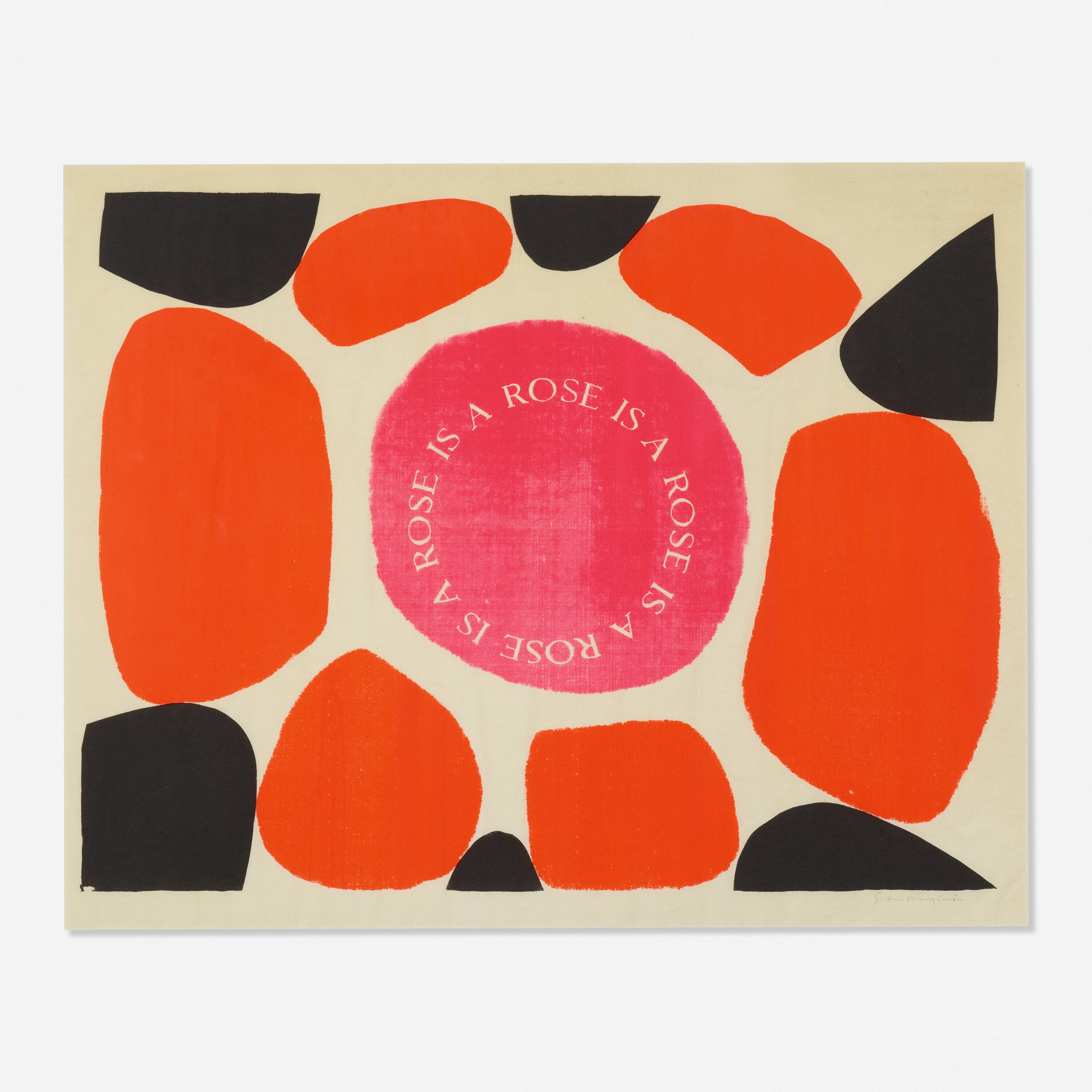
A style that's impossible to ignore
There's so much to love about Corita's visual language.
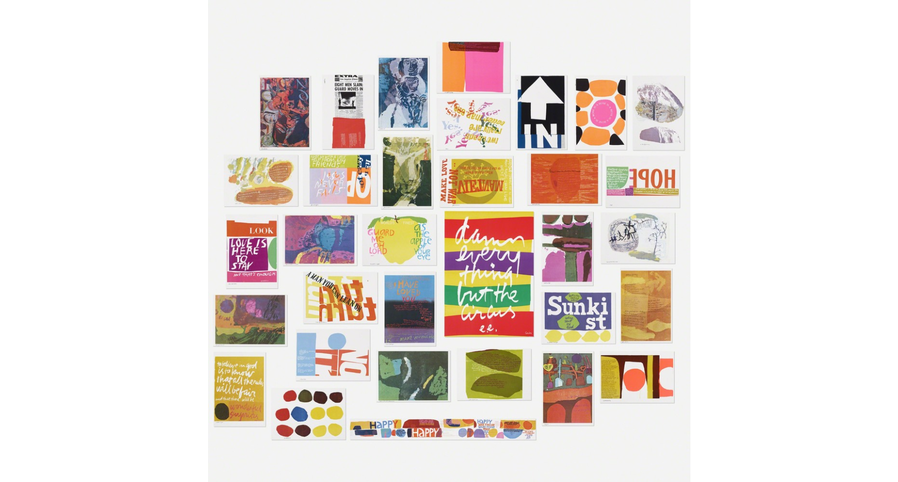
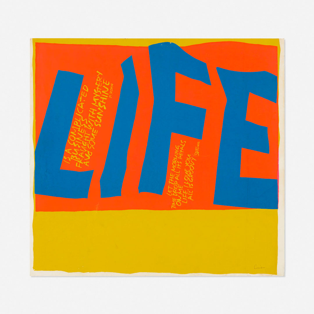
The typography is a particular favourite of ours. Big, bold, distorted, stretched, layered and sometimes seemingly crumpled. Letters become shapes, words become illustrations and typography takes centre stage.
Nothing feels too precious or overly polished. There's an energy to her work that makes it feel alive. Words overlap, colours clash, compositions spill beyond their boundaries and unexpected combinations somehow just work.
Her use of colour is equally brilliant. Electric pinks, sunshine yellows, vivid reds, oranges and blues sit alongside one another in bold, unapologetic combinations. They're bright, optimistic and full of personality.
But there's more to it than simply looking good.
What really makes Corita's work special is its ability to communicate. Her prints were made to be seen, read and understood by ordinary people. She used accessible language, recognisable imagery and striking compositions to make big ideas feel immediate and personal.
There's a wonderful openness to it all. A sense of inclusion, warmth and positivity that never feels forced or overly sentimental.
Her work has a wild intent. It's expressive, sometimes chaotic, often unexpected, but always driven by something meaningful.
And that's perhaps our favourite thing about it.
What can we learn from Corita?
It's easy to look at Corita's work and admire the colours, typography and compositions. But there's a bigger lesson here, particularly when it comes to branding and design.
Look around and you'll see a lot of brands playing it safe. Similar typefaces, familiar colour palettes, predictable layouts and identities that seem to follow an established formula.
Of course, there's nothing wrong with good design principles. But when everyone follows the same conventions, it's easy to get lost in the crowd.
Corita reminds us that there's another way.
Don't be afraid to experiment. Try an unexpected typeface. Play with scale. Push colour further than feels comfortable. Let typography become an image in its own right. Embrace a little imperfection and allow personality to come through.
More importantly, have something to say.
Corita's work wasn't expressive just for the sake of it. Every colour, word and composition helped communicate an idea. Her visual language had a purpose, and that purpose gave it meaning.
For brands, the same thinking applies. A distinctive brand identity should do more than look good. It should communicate who you are, what you believe in and why people should care.
That doesn't mean being different for the sake of it. It means having the confidence to find your own voice rather than borrowing someone else's.
Keep it simple. Make it meaningful.
Perhaps the most important lesson from Corita is that design doesn't always need to be complicated to make an impact.
Her words, her colours and her compositions all came together to communicate some wonderfully simple ideas. Love, kindness, compassion, equality and doing good.
Ideas that are just as relevant today.
We love that she managed to make work that was visually bold, creatively fearless and full of positivity, without ever losing sight of its message.
Be curious. Break a few rules. Try something different. And above all, don't be afraid to be yourself.
Because the world doesn't need more brands that look the same. It needs more that have something of their own to say.